15

Keeping with the little note about "The Seven Essential Meta Questions of Every Beta", I thought I'd open the discussion about the graphical interface of our lovely anime/manga site!


As our site approaches graduation, we were asked to help with ideas regarding the design of our site..

So, I suppose anyone with suggestions should post them on up! I'm sure the whole community would love to see all of your creations!

Ideas, art pieces, thoughts, or anything else would be welcomed :)

Keep in mind that while bits and pieces are alright, we should grasp the big picture of how we want the site before we knitpick the details.

1

11 Answers 11

13

Not sure if this deserves a whole answer, but...

It would be cool if we could have an anime-style mascot. Kind of like Wikipedia's Wikipe-tan or the various OS-tan characters.

5
  • 1
    although I think that would be nice, I'm not sure that (given the amount of different genres inside anime and manga) we could find a mascot that would please all of the community. But then again, we could propose some mascots and have a voting!
    – JNat StaffMod
    Commented Dec 13, 2012 at 16:59
  • 2
    @JNat You're never going to find something that pleases EVERYONE, lol. I think a lot of the design should probably be based off of SE's overall design though.
    – atlantiza
    Commented Dec 13, 2012 at 17:03
  • 2
    Maybe there should be a contest (I don't know how it usually goes down in other SE sites). Both for the overall site design and for a mascot. But a long time from now still... lol
    – JNat StaffMod
    Commented Dec 13, 2012 at 17:04
  • 2
    @JNat All things said, considering Wikipedia managed to get a mascot of its own and it represents a whole larger encompassing sphere of things, I don't think it's hard to imagine something can develop for ourselves.
    – Grace Note StaffMod
    Commented Dec 13, 2012 at 17:11
  • I love the idea of a mascot ! :)
    – Grace
    Commented Dec 14, 2012 at 9:34
11

I like what RPG did with theirs. In particular -

  • The guy on the left and the dragon on the right, is a combination of outline and filled
  • There is a grid background

I think these design elements should be included on the front page since our site also discusses anime and manga production. Perhaps having the scene go from manga-ish from the right to anime-ish to the left.

enter image description here

3
  • 3
    So, sketched look to color. Yep. +1 for this, that would be neat.
    – iKlsR
    Commented Nov 15, 2013 at 18:49
  • 1
    Problem is, most characters shown in anime/manga are copyrighted. Stack Exchange cannot use them freely.
    – Madara's Ghost Mod
    Commented Nov 15, 2013 at 20:05
  • 5
    @MadaraUchiha did you mean to comment here? if you did, then I'm not saying we should use a copyrighted character. I believe the SE GD group can commission original work for the header. I think that's what they did for RPG.SE?
    – anon
    Commented Nov 15, 2013 at 20:27
10

We're still putting bits and pieces together in chat. One suggestion was to use a artistic brush stroke for accepted answers. Here is a quick mockup of how this might look. Again, a final design can/will be decided upon, just fleshing out how the small stuff might look for now.

enter image description here

8

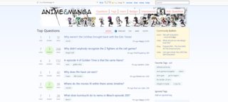
I came up with a rough idea of some random concepts I threw together. This is more or less just a mock-up montage. Obviously we can't use the images as they're copyrighted content, but they serve as an idea of what could be placed there instead.

Here are two early revisions with color balance testing.

Version 1.0 Version 1.1

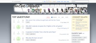
Here is a third version with characters from Uchouten Kazoku in the banner, the lolis and buttons I showed in other answers, and the brush icon that @iKlsR posted, and some color changes. Personally I vastly prefer this revision, because it adds some Japanese culture to the header and makes it a bit more audience-neutral.

Version 2.0

NB: Personally, I like these designs better with a light topbar (clicky), but I don't know if we have a say in that.

Fonts

  • Anime Ace (banner and headers, used in manga scanlations)
  • WeblySleek UI (body, just used for a simple look)

Images

  • Manga panel behind the banner (source)
  • Chibi (anime) characters walking across the banner (source)
  • Uchouten Kazoku banned (screencapped from an episode; Photoshopped for ink outlines)

Colors

  • I chose blues and greys as a lot of manga and anime sites do the same; MyAnimeList, CrunchyRoll, Daisuki, AnimeNewsNetwork, and others
5
  • I would love to see answered questions have something like a brush swipe over the answers bit. Badges could be shurikens etc. Definitely some chibi, our mascot should be chibi for the site icon.
    – iKlsR
    Commented Nov 15, 2013 at 12:43
  • 4
    Needs moar Gundam.
    – кяαzєя Mod
    Commented Nov 16, 2013 at 23:18
  • 2
    The second one looks pretty good.
    – iKlsR
    Commented Dec 2, 2013 at 14:27
  • Really like the top right one. Commented Dec 11, 2013 at 19:27
  • I like the bottom concept for main/meta design (full color - main, outline - meta)
    – Oded Staff
    Commented Feb 26, 2014 at 20:41
6

First of all, I think it's too early to discuss this. The site will only receive it's unique design when it finishes the beta. I think this should wait a couple of days, at least until the open beta starts so more users can vote/share their opinions.

As for what I would like it to look like, a drawn-style, something like there is on http://programmers.stackexchange.com is nice, it should be more anime-like style of drawing though. Programmers.SE looks like the interface is drawn with a marker, that is not going to suit this site.

I also really like the design of area51. It's not even about the pictures or the interface layout, but rather about the fact that it's bursting with colors, and looks very good. For example, if you compare Area51 and Stackoverflow, you will see that SO looks plain and dull (that's my personal opinion). Since we are discussing anime here, not some serious stuff like physics, I think that the site should be bright and colorful (much like anime itself is).

4
  • 1
    FWIW, I draw -- so I'll be happy enough to contribute something to this site (when we get to that point, of course!) Commented Dec 13, 2012 at 16:19
  • 4
    Speaking as a community coordinator for Stack Exchange, I don't think it's too early because of the process timing. You might consider it early in the sense that as a community, we all barely know each other. But no matter the time until graduation, every bit of work done to help confirm a site design is extremely helpful for us to actually create that design when the time comes.
    – Grace Note StaffMod
    Commented Dec 13, 2012 at 17:13
  • @Grace, thanks, that's some important feedback ;) Commented Dec 13, 2012 at 17:16
  • @GraceNote thanks or your support. I think you may or may not be the only one who understood my reasons or posting the question :)
    – Grace
    Commented Dec 14, 2012 at 9:34
6

A somewhat sketchy version of question and answer control buttons. (The checkmark is hollow and grey when not selected.)

Upboat and downboat buttonz!

4

In my opinion, the design of the site should be as neutral as possible with respect to genre and style. This isn't a suggestion, but rather a sort of meta-criterion that I think should be applied to any design for the site.

The reason for this is that the anime community is very broad in terms of interests. Even looking at the site we've already made, this is apparent. There are a number of users who are primarily interested in action series like and . There are also a lot of users with almost no interest in these shows, who instead watch romance, comedy, drama, etc. (I fall into this category). There are people who only read manga, and people who only watch anime, and everything in between.

I've seen sites before which put a bigger emphasis on one or another style or genre in their site design, and this strongly correlates with what sort of a community they have. The sites where one genre or style are emphasized in the design tend to not seem very inviting to people who are not fans of that. We've talked a lot in chat about what effect the questions which show up to new users have on who we're attracting and whether it creates an environment which doesn't seem inviting to them. Having the site design itself do that would be quite a bit more significant in terms of who we're bringing in. If we want to make a site which is really for the whole anime/manga community, that isn't a good idea.

That doesn't mean that I think we should have a totally bland design, like e.g. MathOverflow, but that the design elements that do get modified are fairly unobtrusive and generic. For an example which I think would be problematic, the banner on RPG is really focused on action, which is fine for an RPG site but would not be for an anime site.

The most successful anime sites online in terms of broad appeal are probably MyAnimeList, Hummingbird, and Anime News Network, which have fairly bland looking designs with some images of particular series. We can't do exactly that, but the design should aim to be similarly reserved to those sites in my opinion.

3

Just tossing this one out there. Here is my proposal for how the badges should look. A final design could be decided on but shuriken are pretty prevalent in anime and could work well.

enter image description here

1
  • I guess, given the number of downvotes on this, it's probably worth clarifying why I did so. Shuriken don't strike me as particularly anime-related. At best, they're associated with action shows, and at worst with just Naruto. I couldn't say the last time I've seen any in anime, but it's probably been dozens of shows. With that said, I'm not incredibly opposed to it, but for the reasons laid out in my answer I'd rather avoid anything that seems specific to one or another genre.
    – Logan M
    Commented Dec 18, 2013 at 5:01
3

Lollipops for badges? Because you can never have enough lolis.

LOLIS LOLIS LOLIS LOLIS

Perhaps a tad dark (especially on the silver), but a basic idea.

2

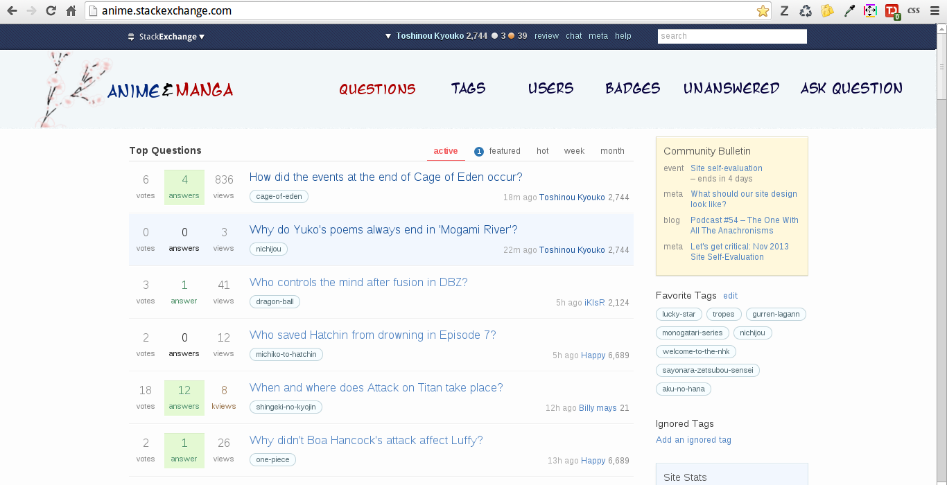
I came up with a minimalistic banner, it doesn't differ from the current one too much, but I think that'll cause less disruption to the site than a brand new one. It also shouldn't offend anyone too much ^_^

enter image description here

Font: Manga Temple

Image: Spring Blossom (Public Domain)

Manga Temple speaks for itself, it's a font that is similar to those that are used in Manga, and are recognisable to be so.

I chose the subtle Sakura/Spring Blossoms as they feature in lots of shows, and not just shoujo.

enter image description here

Alternatively, maybe something could be based off this if it's not prominent enough.

1
  • I think a combination of lots of small changes would be nice, like the brushstrokes & badges above Commented Nov 18, 2013 at 15:48
2

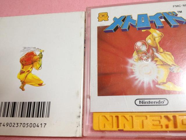
I had a design idea that I'm still trying to conceptualize. The idea is to treat the main and meta portions for the site each like on side of a two-sided anime storyboard or manga manuscript. The front site (main site) has a more finished product with colors, tones, filled in bubbles, etc, while the opposite side (meta) is much rougher with draft lines unfilled/not typesetted bubbles, and mostly in black and white.

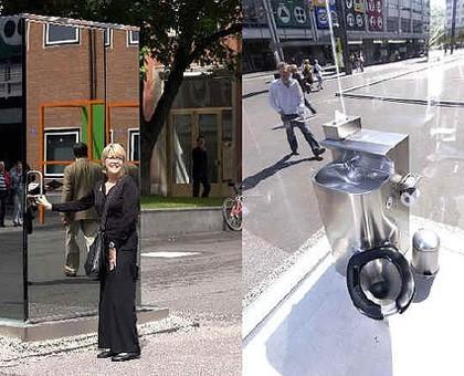
The main idea is to treat the back and front side is if there it were a like window some what mirroring each other. Sort of like a light and dark world, but instead a colored and non-colored world. For an example if in the colored world we see a person's face, in the non colored world we see the back of their heads, like looking at two-sided of a coin from different angles or a perspective inside a room surrounded by two-way mirrors:

And the perspective shifts...

Or front and back covers:

It's Samus!

1
  • Nice concept! I really like this idea.
    – JNat StaffMod
    Commented Jan 16, 2014 at 22:03

You must log in to answer this question.

Not the answer you're looking for? Browse other questions tagged .