Basics
The name of the site should be written in a clear, easy-to-read font in English: “Anime and Manga” or “Anime & Manga.”
The font used should always be the same (in site design, on facebook, etc.): Think like famous, successful logos such as ESPN, FedEx, ebay, Star Wars, etc.
The logo should generally be a square or round shape (think like the McDonald’s “M”, the Apple apple, the Pepsi circle, the Starbucks mermaid, the AT&T “Death Star,” the Nike checkmark, the Superman “S,” logos of TV channels and car manufacturers) so that it can be shown stand-alone in a compact space OR paired next to the name of the site. Notice how the main SE logo does this: there is a square logo to the left of the easy-to-read words “StackExchange.”
The logo should be as simple as possible so that it becomes easily recognizable (McDonalds and Apple’s logos are easier to conjure up in your mind than the Starbucks mermaid or KFC’s Colonel Sanders). Helpful advice is available at the Graphic Design SE: the most useful ones are What are the key principles that effective designs share? and What technical/objective qualities do good logos have?, but there are more here, here, here, here, and here.
I advise no Japanese syllabary (“lettering” such as kanji, hiragana, katakana) in images such as logo, banner, buttons, and mascot design. For those who cannot read it, including it in the logo or on a button could be off-putting and they feel like they are in the dark, like this site is too esoteric. There are other cases in the site where it makes sense to provide Japanese, but not in the site design.
Any illustration needs to accurately reflect standard, recognizable anime/manga art style even if it is illustrated by someone who is not a pro in Japan. Of course real mangaka bear different art styles, but I can almost always detect whether an illustration is professional manga or high-quality doujinshi, versus drawn by a non-Japanese outside of Japan in basic imitation of the general art style (for example, OEL "manga", anime/manga-inspired comics and web-comics, and anime-influenced animation). To convey a sense of authority, the illustration must not look non-anime/manga style (like Avatar: The Last Air-Bender character design) and it must not look like amateur fanart. There are many talented fanart artists on Pixiv, so someone who can pull off authentic-looking anime painted cel (or computer animated) art and/or manga art should be commissioned or recruited if original illustration is desired.
... “Ayama” is counter-intuitive because 1) it is not at all clear to a first-time visitor what the word is supposed to mean, 2) it is not even clear to many of us otaku as to what it is supposed to mean, and 3) Japanese contractions are in the format of the first two syllables of the first word + the first two syllables of the second word, which would be “Ani” (アニ) + “Man” (漫=まん) = “AniMan.” “AniMan” is not a good name to choose because it sounds male-centric (given that “man” is a gendered English word).
Specifics
Logo
Yes.
The Logo and Buttons need to be anime/manga specific (something that originated in anime/manga, not something generally about Japanese culture that could just as easily be adopted for the logo/buttons of the Japanese Language SE or the Japanese Culture SE). Furthermore, something like a cherry blossom is associated by Japanese people with Japanese culture, but it is not a tree exclusive to Japan. The Science Fiction & Fantasy SE uses the Rebel Alliance logo from Star Wars for its buttons, which fits the theme well because it is an image that is specific to sci-fi and is never found outside of sci-fi (it would not fit as a button for any other SE).
An example could be an adaption of an item that was featured in a classic manga or anime, such as an iconic item in Testuwan Atom (Astro Boy) since Osamu Tezuka is generally regarded as the “God of Manga” in Japan and outside of Japan. Oda Eiichiro (who created ONE PIECE) may be the most well-known mangaka alive in Japan today, but adopting something more timeless than current series might be preferable.
... I advise a logo design other than ʞɹɐzǝɹ’s mon (family crest) logo style because, while a mon is recognizable within Japanese culture and among some anime/manga fans, 1) many will not register what it is supposed to be, and 2) according to Japanese cultural convention (as far as I know), new mon cannot be invented, in the same way that certain kanji cannot be combined to create a new name that is considered culturally "proper." It could be viewed as awkward, or at worst, disrespectful, by Japanese visitors to the site.
Banner
Yes.
It should feature the Logo and the name of the site in easy-to-read font.
Google Doodle-style Changing Banner
No.
Google can do it because almost every internet user in the world instantly recognizes the Google logo, so they can make adaptions to it and people will still know they’re at the Google website. Any logo that is not on the level of McDonald’s or Coca-Cola cannot change up their logo or visitors can get confused.
Google Doodles already feature Japanese holidays and occasions such as Setsubun, Hina Matsuri, Tanabata, etc. so it would not be unique to do this at SE.
Mascot
Yes.
Anime/manga tend to have mascots, so it is fitting.
The mascot can be the logo, or it can be used elsewhere. Like a logo, it should be simple (not require a lot of lines to draw).
Preferably a cute chibi (square-ish) mascot (think like magical girls' animal guides, or cell phone charms carried by anime characters), since those are more common in anime/manga than human-sized or non-cute mascots.
Button Icons and "Ask a Question" Button Gimmick
Yes — but only if these are originated in anime/manga and not too series-specific.
This site should ideally feel inviting to fans of shounen, shoujo, children’s anime, etc. Choosing buttons or a gimmick that some demographics would not recognize would not help broaden the user base, and could send an unintentional message that a certain series or genre is more important than others.
Again, something from an established and renowned classic like Tezuka’s work might be better than something contemporary.
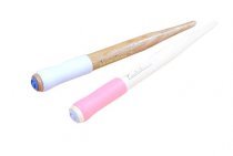
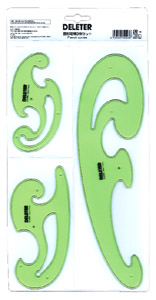
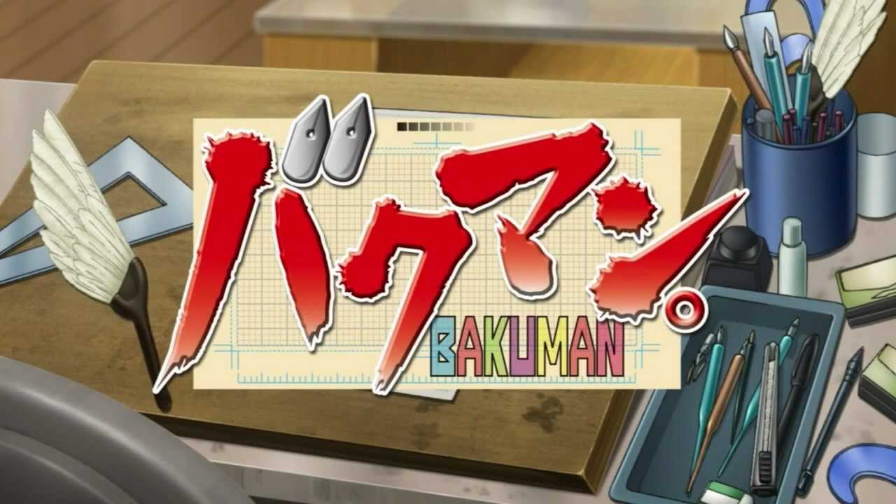
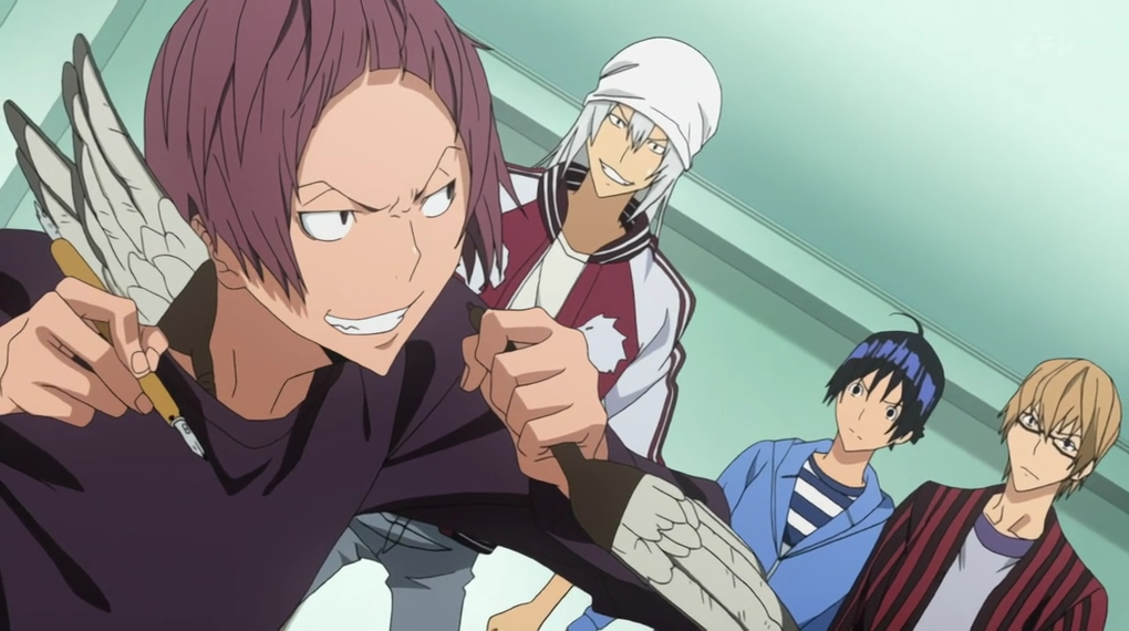
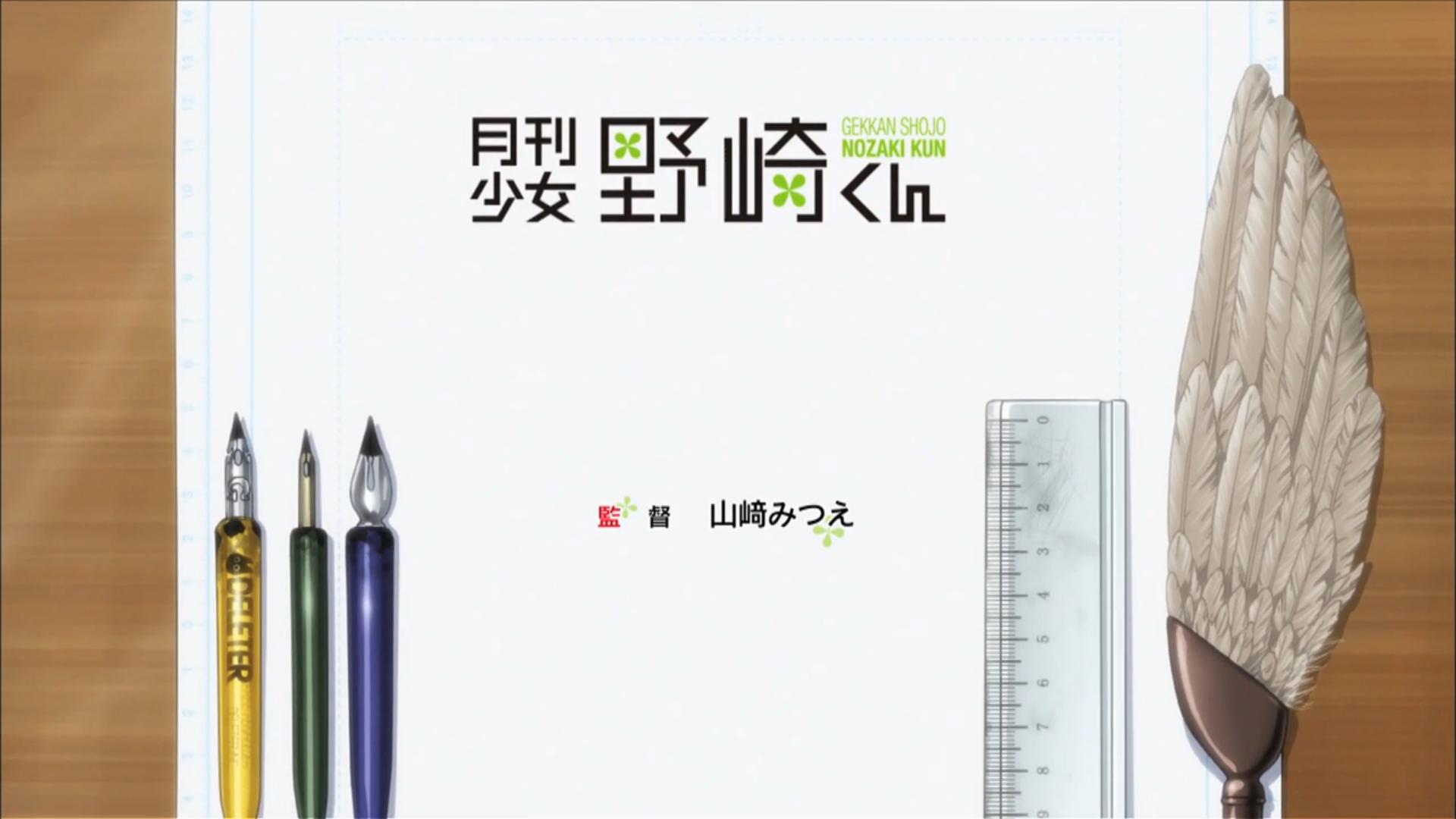
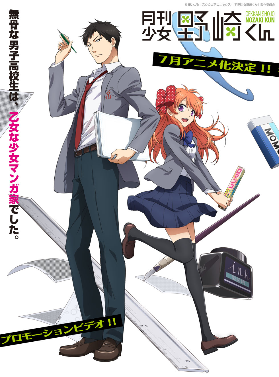
An alternate theme for buttons could be a small illustration of a tool of the trade used in manga illustration or in anime production (before some artists have switched over to computer), such as the feather sweeper which is iconic in Bakuman. and can be see in Gekkan Shoujo Nozaki-kun and Mangaka-san to Assistant-san to, or the curve ruler or the chunky black ink bottle.


Badge Icons
Yes.
Again, something that originated in anime/manga yet not too specific that some people feel left out.
The Arqade SE uses coins, so it would not necessarily overlap to think up something that connotes leveling up in a game.
Although it is specific to one anime title, if it could be somehow accomplished without committing copyright infringement, how about a "poké ball" (known as a "monster ball" in the original Japanese version)? 1) Pokemon is not strongly associated with a particular genre such as moe or shoujo and the series has been running non-stop from 1997 to the present without signs of running out of steam even though it has spawned a bunch of copycats, 2) the series became well-known around the world beyond the otaku demographic (from little kids up through their parents) via the video game and customizable card game (and the infamous news story about seizures) and the animated part of the franchise is generally understood to be Japanese animation by non-otaku, and 3) it's a "gotta catch 'em all" item which fits the idea of collecting badges. How did the Science Fiction & Fantasy SE get permission to use a Star Wars logo for their buttons?
... I advise badges that do not reflect the imperial regalia, since that is political, historical, and cultural rather than anime/manga specific.
Site Design
Yes, if it is clean.
The best site design is simple (think of Wikipedia, Anime News Network, etc.) and primarily white in background color, so visitors can easily find things quickly.
A simple, clean layout connotes authority, which helps visitors and users trust that the answers are reputable and trustworthy (for example, see StackOverflow SE, the English Language & Usage SE, the Mathematics SE, etc.).
Even though the Arqade SE uses bright colors, the artwork is very simple (retro) rather than in-your-face excitement bursting at the viewer.
See What are some common mistakes that a designer can make when designing for web, and how can they be avoided?, What makes a design professional?, and How to direct users eyes on a website at the Graphic Design SE.
Color Scheme
One idea: Bold color on the left side margin to represent anime, and black and white on the right side margin to represent manga.
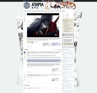
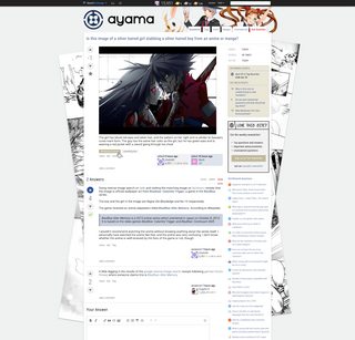
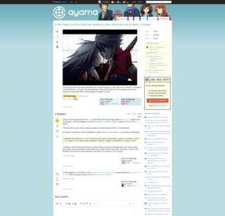
This could be done with キルア’s idea of the manga sheets hanging out from each side: it could be the edge of anime cells on the left and the edge of manga pages on the right. This would have color, fit the theme of the SE, but not be intrusive.
See How can I improve my color selection skill? at the Graphic Design SE.
CSS Style
No.
I second Ankit Sharma's concern about season-based design (unless it were optional in account settings, so some users could opt to see a simple/clean layout similar to the current one, some could choose summer, and some could choose winter, based on their location on the globe). Ideally, SE would be frequented by people from many nations, and they ought not be off-put by a northern hemisphere-centric design just because Japan is north of the equator.
What is the first thing you want users to see when they visit the site?
Name of the SE in clear font, links to “About” and “FAQ” for first-time visitors, and a list of Questions.

