4

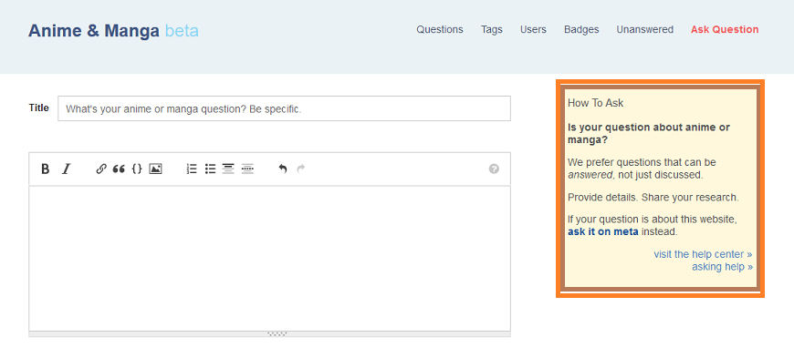
The box in question is shown below.

box

The questions we've been receiving lately do not contain the sufficient amount of detail as stated by the guidlines. How is the person supposed to post a good question if they can't see the general guidelines?

At present, the box is like a green-signal for low-content questions. The Provide details. Share your research. just encourages them to post whatever they have, regardless of the quality of the content.

With the box containing better instructions and a more eye-catching color, the user wouldn't have a problem noticing it and it can also save us time and effort.

Can the existing box be tweaked to contain the general criteria link as well as other useful links?

15
  • 1
    The "How to Ask" sidebox isn't editable (without looping in the community team, anyway) as far as I know.
    – senshin
    Commented Mar 30, 2015 at 17:23
  • @senshin wouldn't the community team consider doing it ? It looks dull. Seriously Commented Mar 30, 2015 at 17:43
  • Maybe? But the "How To Ask" box looks the same on pretty much all Stack Exchange sites, so maybe not? More to the point, I rather doubt that people actually pay much attention to that box anyway.
    – senshin
    Commented Mar 30, 2015 at 17:45
  • People pay less attention to it because of its current appearance? In other words, there isn't anything about that box that would make people go through it. Commented Mar 30, 2015 at 17:49
  • Well, it's more that there's nothing forcing people to read the box. If you add more text to the box, people are even less likely to read it, I would imagine. I mean, sure, some people will glance at it and maybe pay attention to it, but most people will just skip past it, and get straight to writing their question, no matter what we put in the box.
    – senshin
    Commented Mar 30, 2015 at 17:51
  • Well, I'm not asking to add more details. Editing the present details could be feasible (if they consider doing it). Simple links can replace the existing lines. Its better than posting the guidelines link as comment. As for your last line, then what is the purpose of the box? We know that most people wont/dont go through it, then why do we still keep the box ? Commented Mar 30, 2015 at 17:57
  • I guess we keep the box because we have empty space next to the question-editor and we may as well put something there? (i.e. if even one person asks a better question after reading the box, it's worth having.) If you're suggesting replacing the existing contents of the box with something of about the same length that you think will be more useful, I think that could be a good idea.
    – senshin
    Commented Mar 30, 2015 at 18:01
  • Yeah I'm suggesting that :) Let's see what the others have to say Commented Mar 30, 2015 at 18:04
  • 2
    It doesn't say much, yes, but it says enough for a smart person to understand there are rules. The two links for help center and asking help say that there exist detailed guidelines. Nice users would follow these links and figure out how to properly ask, but remember that this is the minority of cases. New users usually come from much simpler places like Yahoo answers, which don't have any strict rules or guidelines. We have comments and close reasons in case the user expects us to be the same, and the two links in this small box for cooler users :p
    – Hakase
    Commented Apr 6, 2015 at 18:10
  • 1
    Lol @Hakase, well put. But I still think id-req guideline, if added, can help us and them. Majority of the questions we receive are id-reqs and majority of that ends up getting closed due to poor content. The link in the box can say Are you trying to identify an anime or manga? Then click here . The bold font might catch the users' eye and by not revealing that the link leads to a guideline, increases the chance of the user seeing the guideline. But anyways, +1 to your points :D Commented Apr 7, 2015 at 0:41
  • Actually I proposed the exact same thing recently, but didn't get to post a feature request because I thought that it would clutter the site design and be largely useless for all users who are not asking for ID requests. And the comments along with close messages nicely play the role of "warning boxes", along with linking to the help info. Just because some users are having trouble asking specific kinds of questions, I don't think putting a notification visible to everyone is the right decision. But that's just my opinion.
    – Hakase
    Commented Apr 7, 2015 at 10:12
  • @Hakase Yeah. I've thought about that too. It is kinda unthoughtful but I thought since our stack is approaching graduation (I think), a new box exclusive to A&M SE wouldn't be much of a bother. Commented Apr 7, 2015 at 10:19
  • A lot of users don't even bother to improve their posts even after they're given all the links. In my opinion, we should enforce our rules more strictly and close obviously bad requests, so users will see that they will not get any answers unless they improve. Otherwise it's wasting space on our site and not being useful to anyone. And requests closed for too long should be removed. I think this will be effective enough measure to teach users to post better ID requests.
    – Hakase
    Commented Apr 7, 2015 at 10:28
  • Agreed. @Hakase maybe you should try a meta post on the deletion part. Commented Apr 7, 2015 at 10:43
  • @Hakase: Requests closed for too long, which has 0 score or less, will be removed automatically eventually.
    – nhahtdh
    Commented Apr 13, 2015 at 6:30

1 Answer 1

3

I think this feature request is a good idea, mainly because I think this is a good way to try and reduce the number of identification requests that we get on this site. Sometimes I come across an identification request that I know the answer to, and I have to hold back from telling the asker because that would just encourage more off-topic questions, which just makes me feel bad! (cough Until Death Do Us Part cough).

If possible, I'd rather we be preemptive rather than reactive. In the spirit of the "Just In Time" Theory of User Behavior, I think people are much more likely to read something (e.g. "No identification requests") if it's right in their face as they're writing their question. Right now, all of the information about what's on-topic and what's not for this site is hidden away in places like Tour, Help, and How to Ask, which all sound really optional to the average user.

I think r/WritingPrompts has their sidebar text pretty figured out: A very clear "read this before submitting", and a brief overview of the most salient rules/guidelines, with additional links for more specific details. And the sidebar text stands well on its own even if the user doesn't open the links. Maybe we could change our sidebar text to something along those lines? (If nothing else, it'll make me less guilty about voting to close off-topic questions because then I'd know that the asker can't be bothered to get to know the rules, rather than just being innocently unaware that such rules exist :/)

The Hardware Recommendations Stack Exchange has gotten their sidebar text changed in the past, so it ought to be doable, although we'd need to involve the community team.

And we'd probably need to have a consensus on the exact desired wording to have any shot at this being processed.
You must log in to answer this question.

Not the answer you're looking for? Browse other questions tagged .